There are a range of approaches for visualising non-spatial data over time. For me, to be effective and useful the method needs to:-
- Illustrate, uncover or summarise patterns in the data that would be less visible otherwise;
- Preserve relationships and proportionality;
- Be based on sound and understandable underlying statistical/mathematical methods;
- Ideally have open tools or scripts available for use
The following post seeks to summarise some good techniques using a few key publications and examples.
Stacked Graph Approaches for Linear Series
These approaches work for data that can be aggregated so that the overall size of the graph is meaningful.
Lee Byron’s Stream Graph uses Last FM Audioscrobbler data to illustrate a user’s listening habits over time. According to the authors, the visualisation method was popular with users who were able to associate their listening habits with life events and time of year. Data is extracted in the form of number of plays per month, per artist. The visualisation approach is similar to ThemeRiver - a smoothed, stacked graph centered on the origin and expanding either side - but adds some further algorithmic smoothing. It also selects an ordering which places the early onset series toward the centre and subsequent onsets at the top and bottom. The software is available via the above link and uses Java/Processing. There is also a javascript implementation in the d3.js library

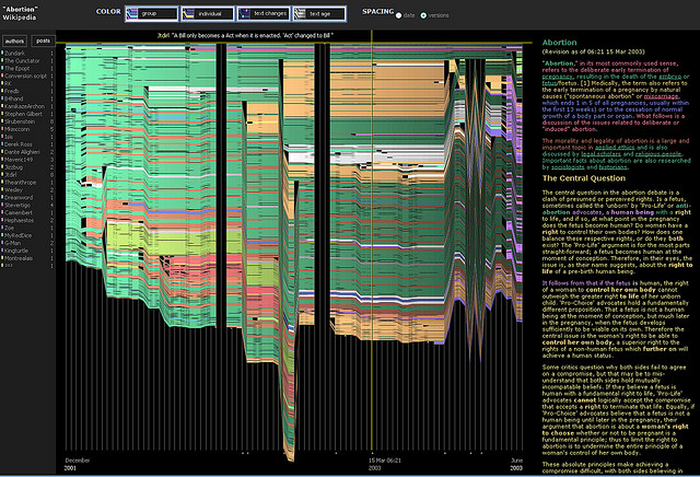
IBM History Flow was used to create compelling images of editing patterns to Wikipedia pages and illustrates the number of users involved in addition to the page length (so the more radical revisions are visible as large “steps” - edit wars become zigzags.). The researchers used the Wikipedia revision history and token matching to detect changes between versions. The program was written in Java but is not available for direct download.
Spiral Graphs for Cyclic Series
Here, the axis is arranged spirally and scaled according to periodicity in the data. If not known in advance, periodicity may be detected by either animating through different cycle lengths (see a good example at EagerEyes) or by computing a spectrum using Fourier transform (for regularly spaced data) or least squares fitting of sine and cosine functions. The spiral shape and the distance between plotted points are fairly easy to calculate. The example on the left shows daily sunshine intensity, with cloudiness between days easily comparable. The formulae to compute the spiral and scale the plotting are available in the paper below by Weber et al. Some code to create a spiral plot in R using ggplot2 is avaiable.
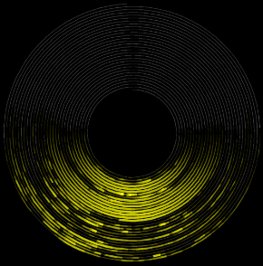
The right hand example - Flickr Flow - combines the spiral graph and stacked graph approaches, showing predominant colours in Flickr Photos by season (summer at top, autumn on right, winter bottom, spring on left).
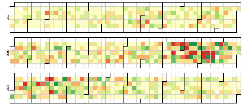
Calendar Views for daily data points
Here, daily average values or cluster groups are colour coded and displayed in a calendar. The example below is from the d3 javascript site and displays Dow Jones averages from Yahoo Finance.
Evolutionary / Version paths
This type of visualisation has a long history. A stemma codicum is used by philologists (text scholars) to track versions of a manuscript, based on modifications that can be tracked over time from an original version. This example tracks versions of Dante’s Divine Comedy between 1321 and 1355

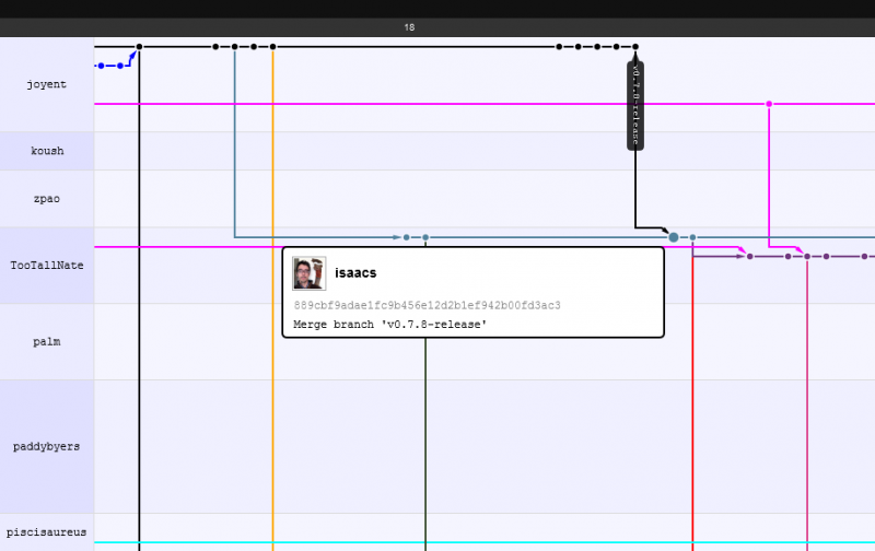
A modern equivalent is the visualisation of source code repositories, such as the network viewer on GitHub. The following shows some recent activity on Node.js repositories. Users are shown down the left, with the timeline along the top. Each node is a “commit” to the repository. Connections between repositories via forking and merging changes are shown, along with major releases:
References
AIGNER, W., MIKSCH, S., MULLER, W., SCHUMANN, H. and TOMINSKI, C., 2008. Visual methods for analyzing time-oriented data. Visualization and Computer Graphics, IEEE Transactions on, 14(1), pp. 47-60
BYRON, L. and WATTENBERG, M., 2008. Stacked Graphs – Geometry & Aesthetics. http://www.leebyron.com/else/streamgraph/download.php?file=stackedgraphs_byron_wattenberg.pdf
MAZZA, R., 2009. Introduction to information visualization. London: Springer.
VIÉGAS, F.B., WATTENBERG, M. and DAVE, K., 2004. Studying cooperation and conflict between authors with history flow visualizations. http://alumni.media.mit.edu/~fviegas/papers/history_flow.pdf
WEBER, M., ALEXA, M. and MULLER, W., 2001. visualizing time-series on spirals. http://ieg.ifs.tuwien.ac.at/~aigner/teaching/ws06/infovis_ue/papers/spiralgraph_weber01visualizing.pdf